A well composed photograph speaks to its viewer, guides their eye throughout the image, and builds a connection between artist and viewer.

The “wow” factor comes when multiple elements of composition come together like a treasure map to guide your viewer to the gold!
In the spirit of social distancing, I’m digging into the not-so-distant past for these winter gems at the Anchorage Museum, to show you how intentional composition takes one scene from drab to fab!
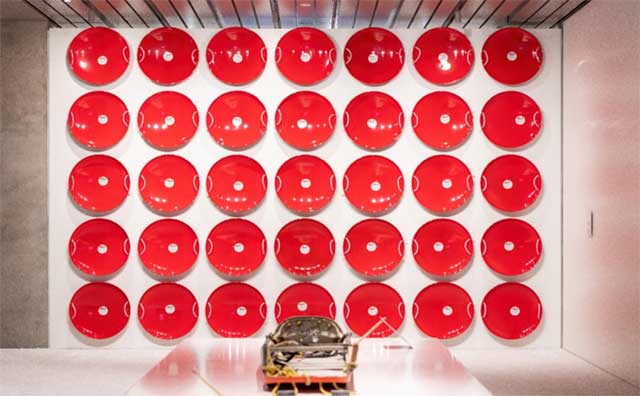
The first image, while an okay snapshot at first glance, has many elements which make it unsuitable for sale.

Aside from the in-your-face imbalance of light, harsh foreground shadows, and distracting items reaching up out of the bottom of the frame…this image is just plain boring, yet overwhelming all at once.
The sled in the foreground (which, as the object closest to the camera, naturally draws the eye) is out of focus and too close to the bottom edge of the screen causing the viewer’s eye to leave the image. The red overpowers the entire scene.
Now, let’s take a look at the same scene but with a different composition…

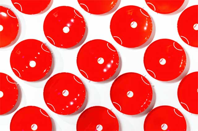
Taken only a few feet from the first, this image is much more interesting and highly saleable simply because of the compositional elements used.
In this second image, the subject fully fills out the frame, thus eliminating all of the distractions from the scene while simultaneously changing the perspective dramatically. Now the viewer is drawn straight into the image, as if they are standing in the scene. It’s no longer a photo of a wall of saucers…it is a wall of saucers!
It reminds me of one of my favorite photography quotes by the legendary photojournalist Robert Capa, “If your pictures aren’t good enough, you aren’t close enough.”
However, it’s not perspective alone working hard to make this image work.
Now, the color red is the star of the show, rather than the smack in the face it is above. Isolating the colors to red and white brings an eye-pleasing simplicity.
Lines and patterns provide channels for the eye to wander.
The minimalist aesthetic provides an avenue for the mind to wander.
While symmetry and balance anchor the image down, an odd number of saucers, rows, and columns subconsciously makes the viewer happy because it feels whimsical.
So the next time you raise your camera to point and shoot, ask yourself how you want your composition treasure map to guide your viewer!

